When the vision is still vague
When you are in the early stages of a rebrand, it can be hard to picture where things might go.
That was the challenge for Alcom, a carbon markets and technology company working at the cutting edge of the decarbonisation space. Their founding team had a good instinct for what they wanted the brand to feel like, something more modern, science-led and relevant to their industry. But the idea was still vague. Stylescapes helped crystallise that idea into something tangible, giving them a clear view of where their new identity could go.
As a group of three stakeholders, each with slightly different instincts, the process also gave them an opportunity to compare options, clarify preferences and align as a team.
Why stylescapes?
A stylescape is a curated visual board that explores what a brand could feel like. It combines imagery, typography, colour, layout and design references in a way that’s more expressive and directional than a traditional mood board, but without being a full identity design.
That makes stylescapes ideal for situations like this: where the creative direction needs shaping, and where founders and stakeholders (especially those without a design background) want something they can respond to visually and instinctively.
Setting the direction
During our brand discovery session with the Alcom team, we mapped out key brand characteristics that would guide the creative work. These insights came directly from the team’s own words and priorities, qualities they wanted the brand to convey, and ways they wanted to be perceived in the market.
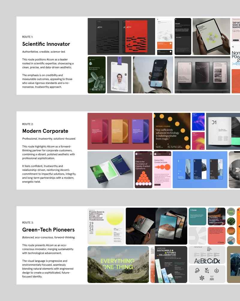
From that session, we shaped a working set of characteristics to explore through the stylescapes:
– Authoritative, credible, science-led
– Professional, trustworthy, solutions-focused
– Balanced, eco-conscious, forward-thinking
– Innovative, tangible, impact-driven
Each stylescape was built to highlight different combinations of these traits. Some leaned more toward corporate clarity, others toward environmental innovation but all stayed rooted in the core themes identified in the discovery session.
The importance of narrative
Each route was also presented with a short written narrative. This is an important part of the process, especially for non-visual stakeholders. The narrative acts as a bridge between strategy and visuals, helping the client see how each creative route connects to the underlying goals of the brand.
For Alcom, these narratives made the decision-making process more grounded and strategic. They were not just responding to colour and type, but considering how each direction aligned with their ambitions for the business.
Collaborative by design
After presenting the routes, I invited comments from each of the three key stakeholders. Because they each had different perspectives, this helped surface valuable insights and by combining those inputs, we developed a fourth route: Carbon Tech Visionary.
This fourth direction blended elements from Routes 1 and 3, capturing a creative balance that the team as a whole could get behind. Because it had been shaped through their own feedback, it also gave them a greater sense of ownership and buy-in.
Why it worked
In a project like this, the goal is not to lock in every detail, but to build clarity and confidence.
The stylescape process gave Alcom’s founders a shared view of what their new brand could be, aligned them around a clear direction, and provided a tangible foundation for the identity work that followed.
A simple but effective way to move from “we know what we want, but we can’t quite picture it” to “this feels right, let’s go there.”
Just one of the ways a simple creative tool can make a complex project feel clearer.