
Astra
Astra is a concept brand that explores what a confident, future-facing sunglasses label could look and feel like. The project set out to balance bold minimalism with a distinct edge, creating a brand that feels premium yet independent. From naming and tone to typography, symbolism, and campaign imagery, every element was designed to work in harmony, presenting a fully realised identity that captures both substance and attitude.
Astra began as a studio-led exploration into what a confident, future-facing sunglasses brand could look and feel like. The goal was to create something bold, minimal and iconic. A brand that felt premium and independent, with just enough edge to carry a distinct attitude.
The name Astra was inspired by the stars and the sun, a simple starting point for a brand focused on sunlight, style and self-expression. The tone of voice blends confidence with a laid-back attitude, mixing optimism with subtle cultural references. It hints at a lifestyle that’s more about good vibes than bad ones.
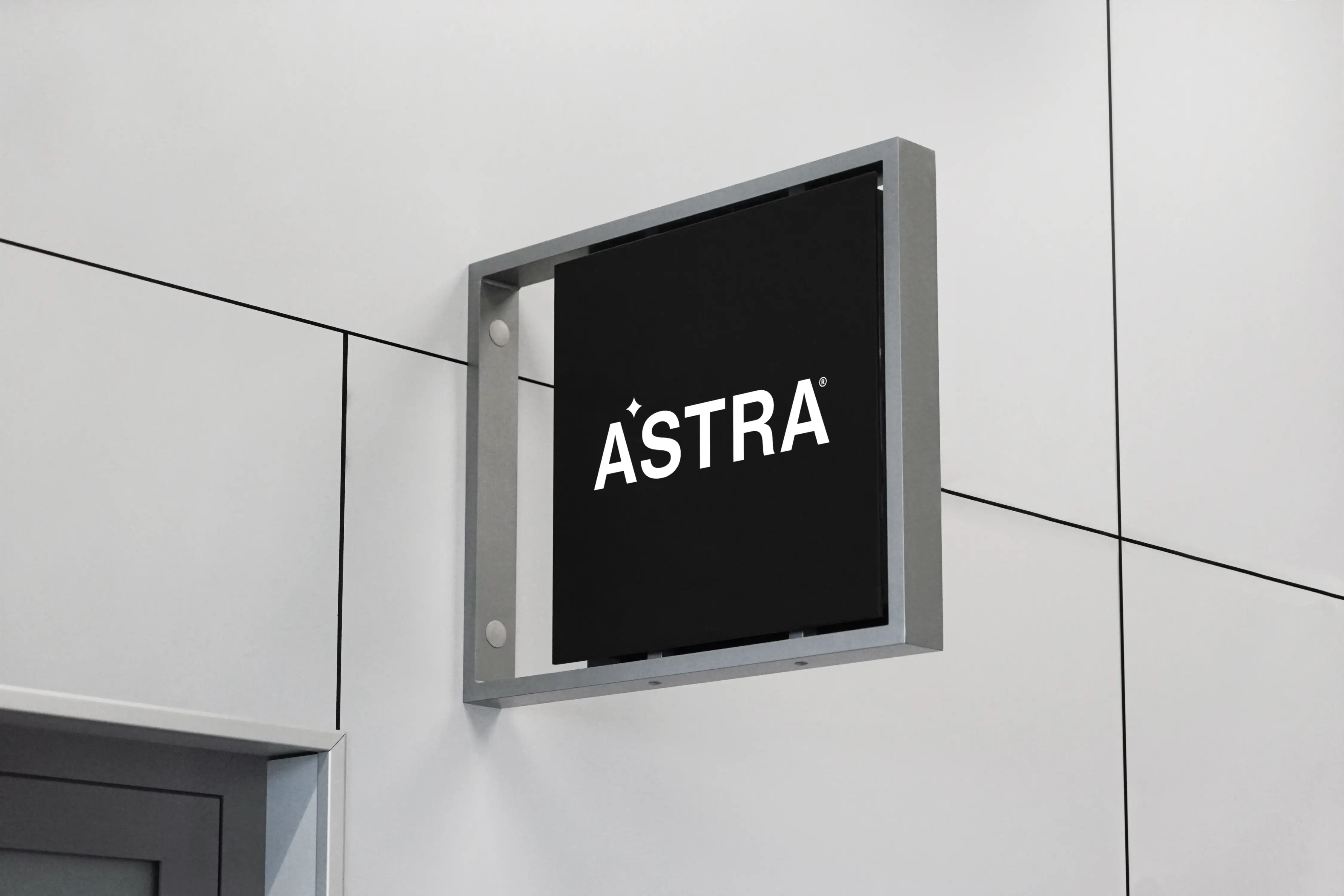
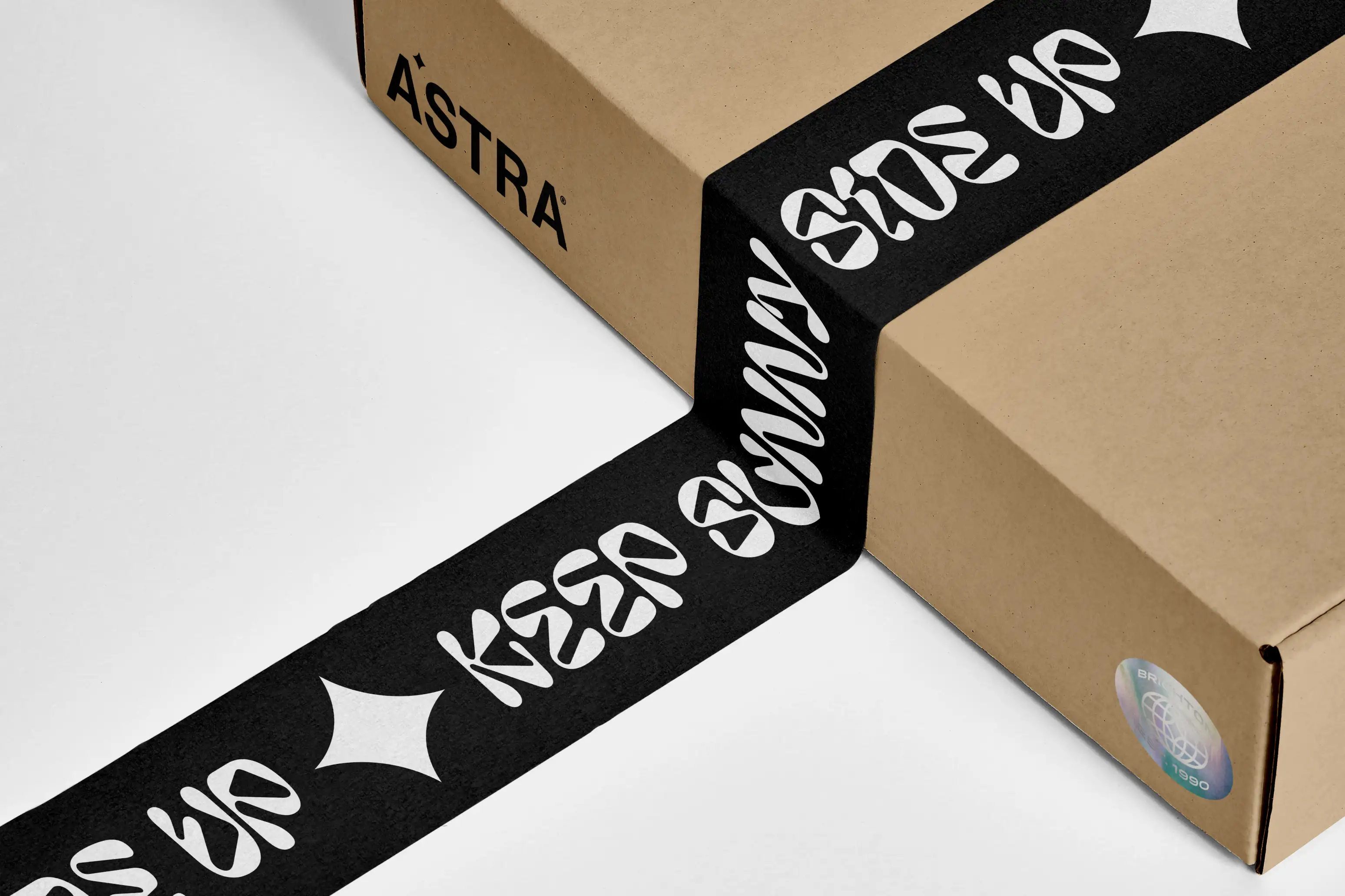
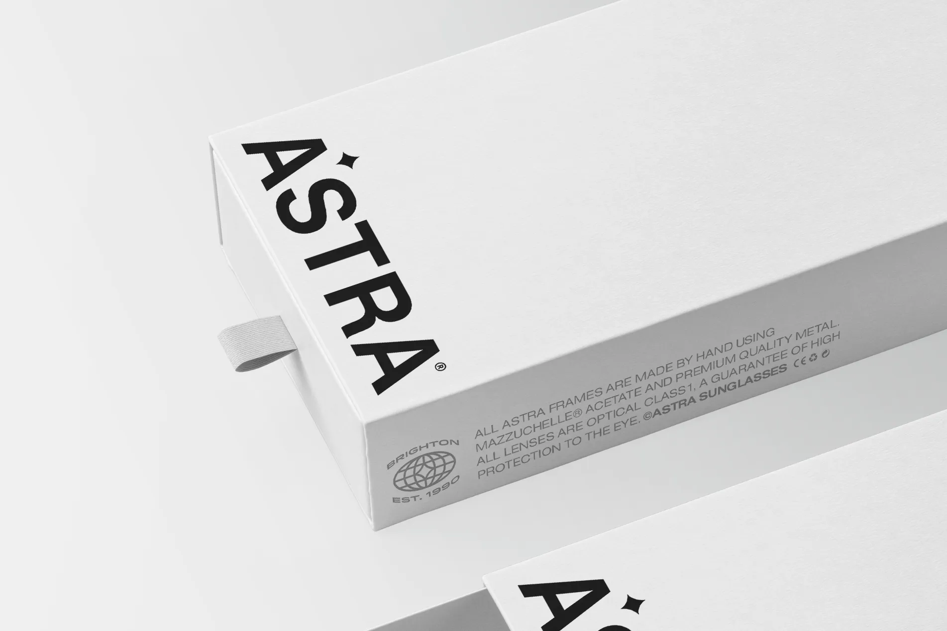
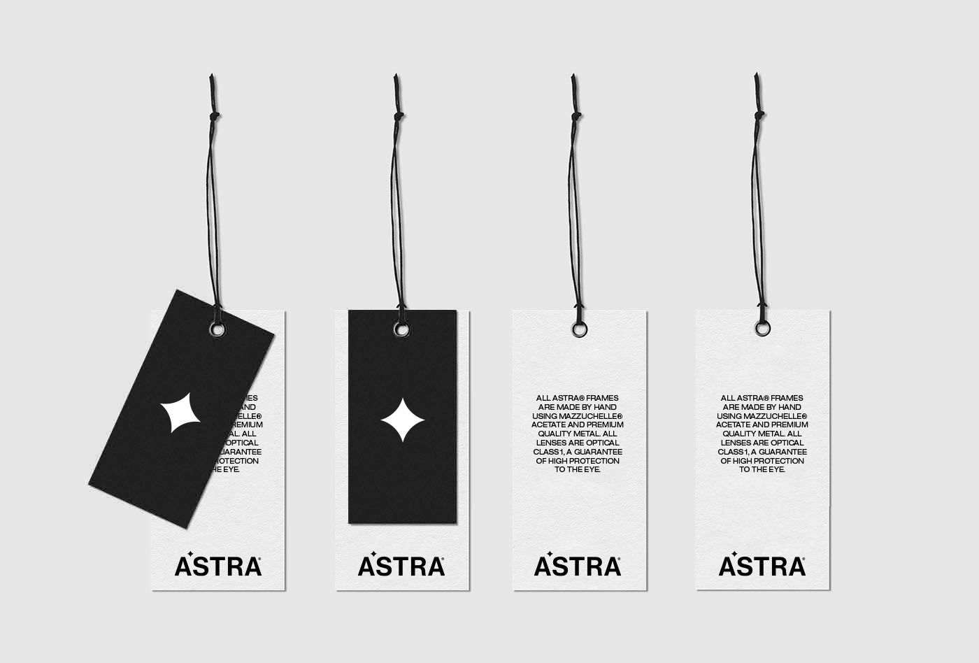
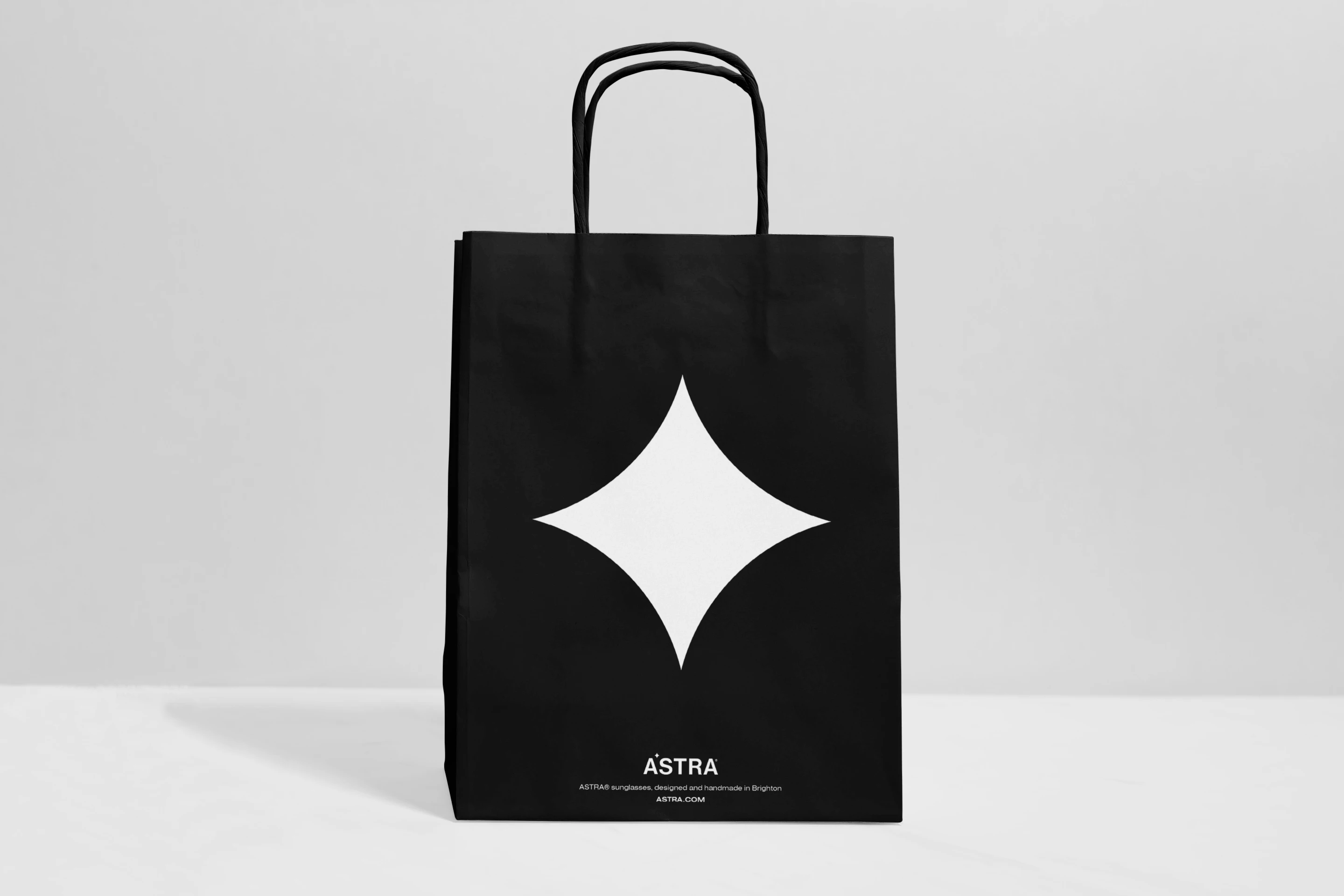
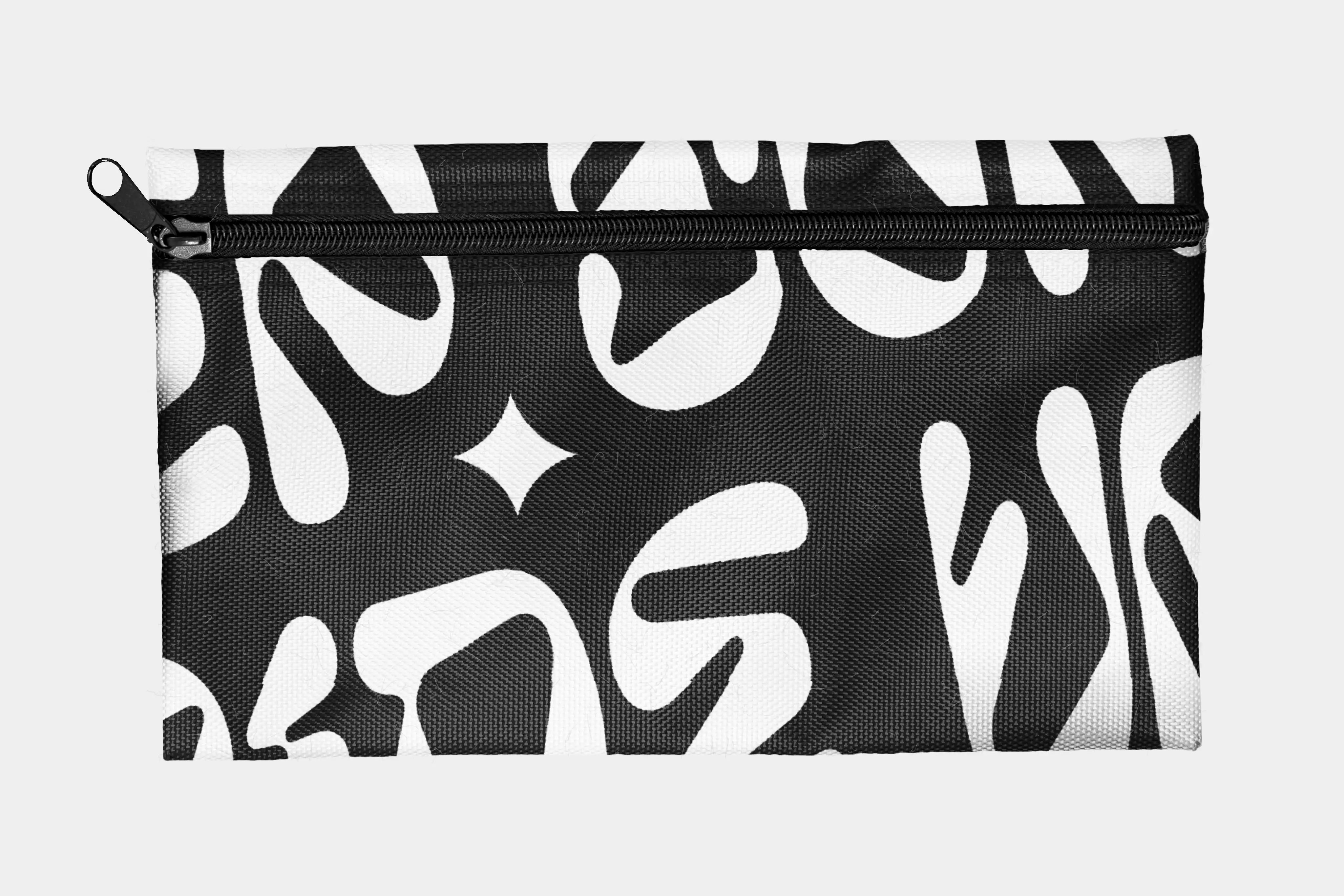
Astra was designed to feel fully realised. A brand you could almost walk into. From outdoor ads to packaging details, every element was imagined with intent. Tactile materials grounded the brand in something physical and premium. Supporting marks and symbols extended the identity with quiet consistency, appearing naturally across packaging, product and in-store moments.
Campaign imagery and type treatments carried the tone beyond the product, keeping things sharp, editorial and expressive. The result is a brand that feels alive, with just enough tension between concept and execution to keep it interesting.
Astra was a chance to push further into full brand narrative work, from naming and strategy through to tactile execution. It was also an exercise in cohesion, making sure every detail served the tone of the brand and felt consistent across a wide range of touchpoints. The result is a confident and coherent concept for a fashion-forward brand that knows exactly who it’s speaking to.

This project was about proving that every detail, from naming to packaging, can serve a single attitude. Astra became a way to show how cohesion builds confidence.