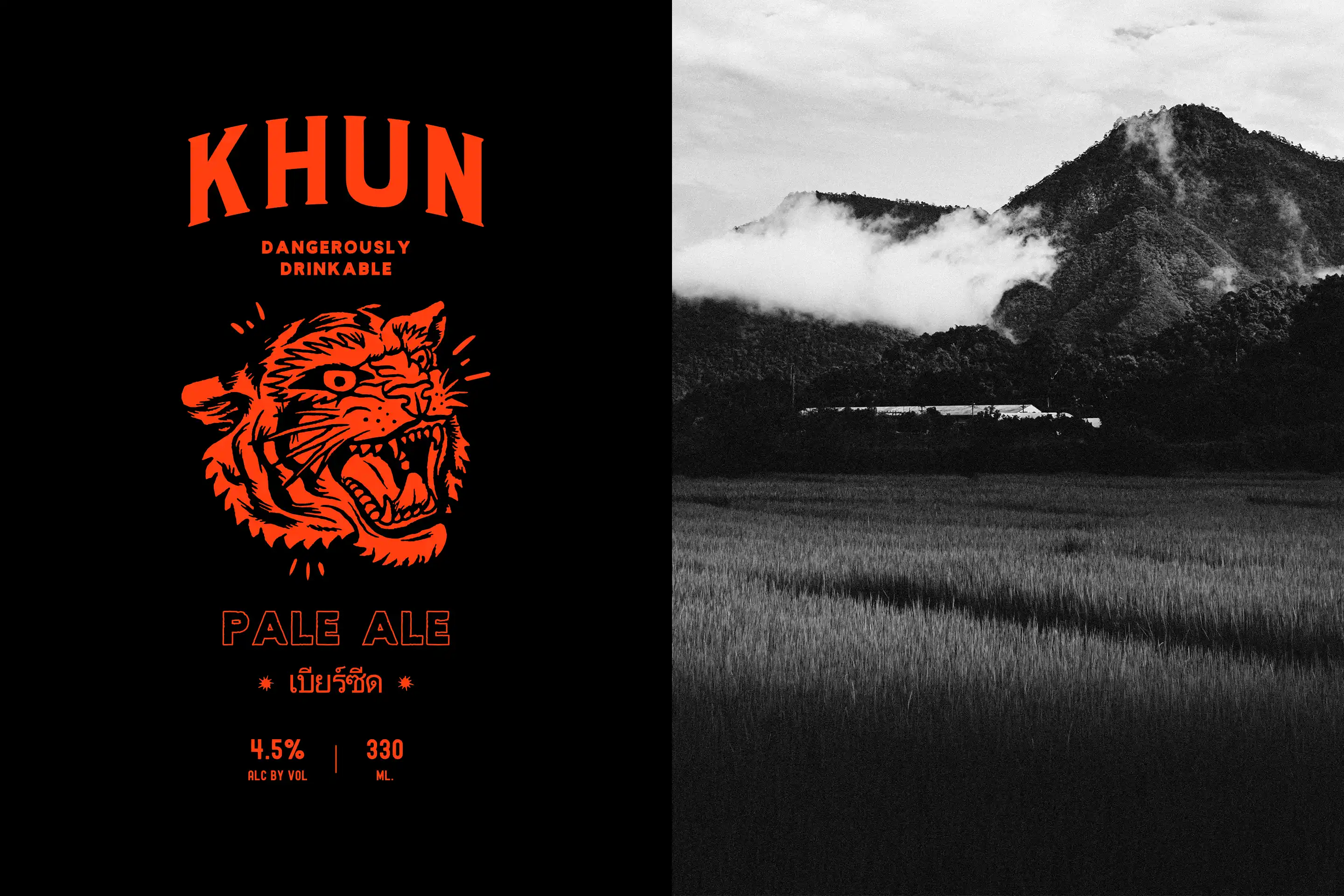
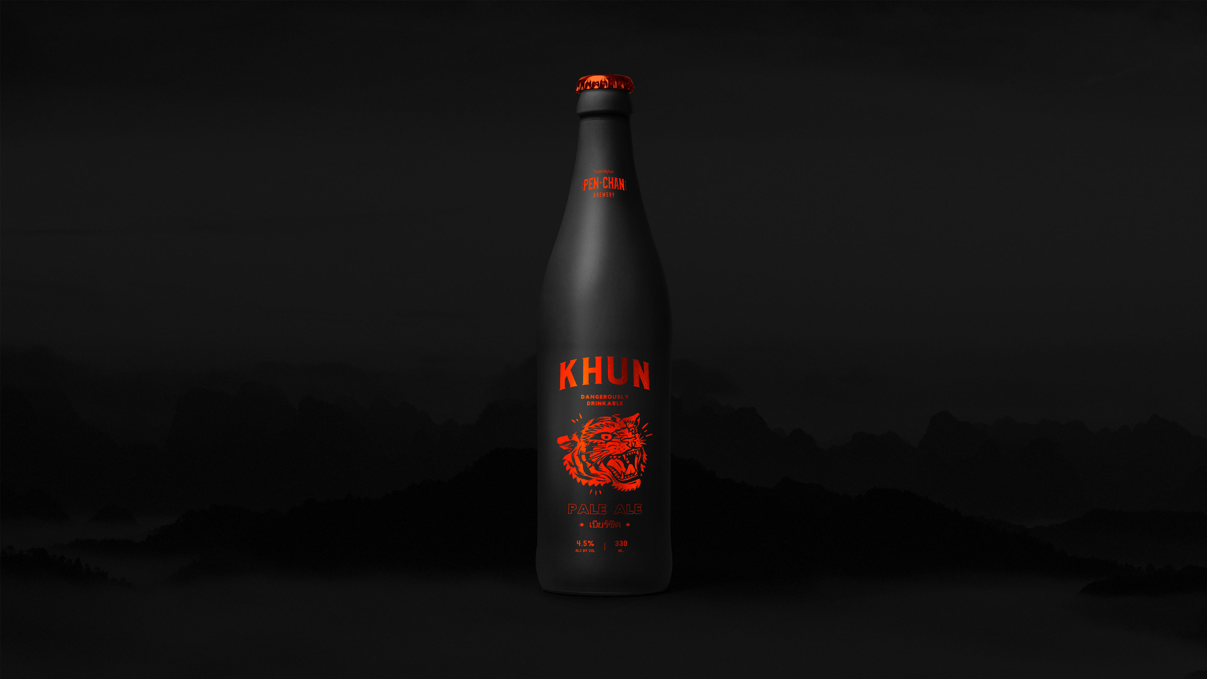
Khun
Khun is a conceptual pale ale brand that explores how packaging can carry real cultural intent while staying bold and exciting. Rooted in Chiang Mai’s landscape and the story of its extinct tiger population, the identity fuses attitude with purpose, balancing raw visual energy with a clear narrative of conservation and community.
Khun began as a visual exploration of how brand and packaging can carry a real message without losing edge. The aim was to build something bold, attitude-led and visually distinct. A product that feels exciting on the surface but rooted in something deeper. This wasn’t about designing for shock or novelty, but about showing how personality and purpose can live in the same space.
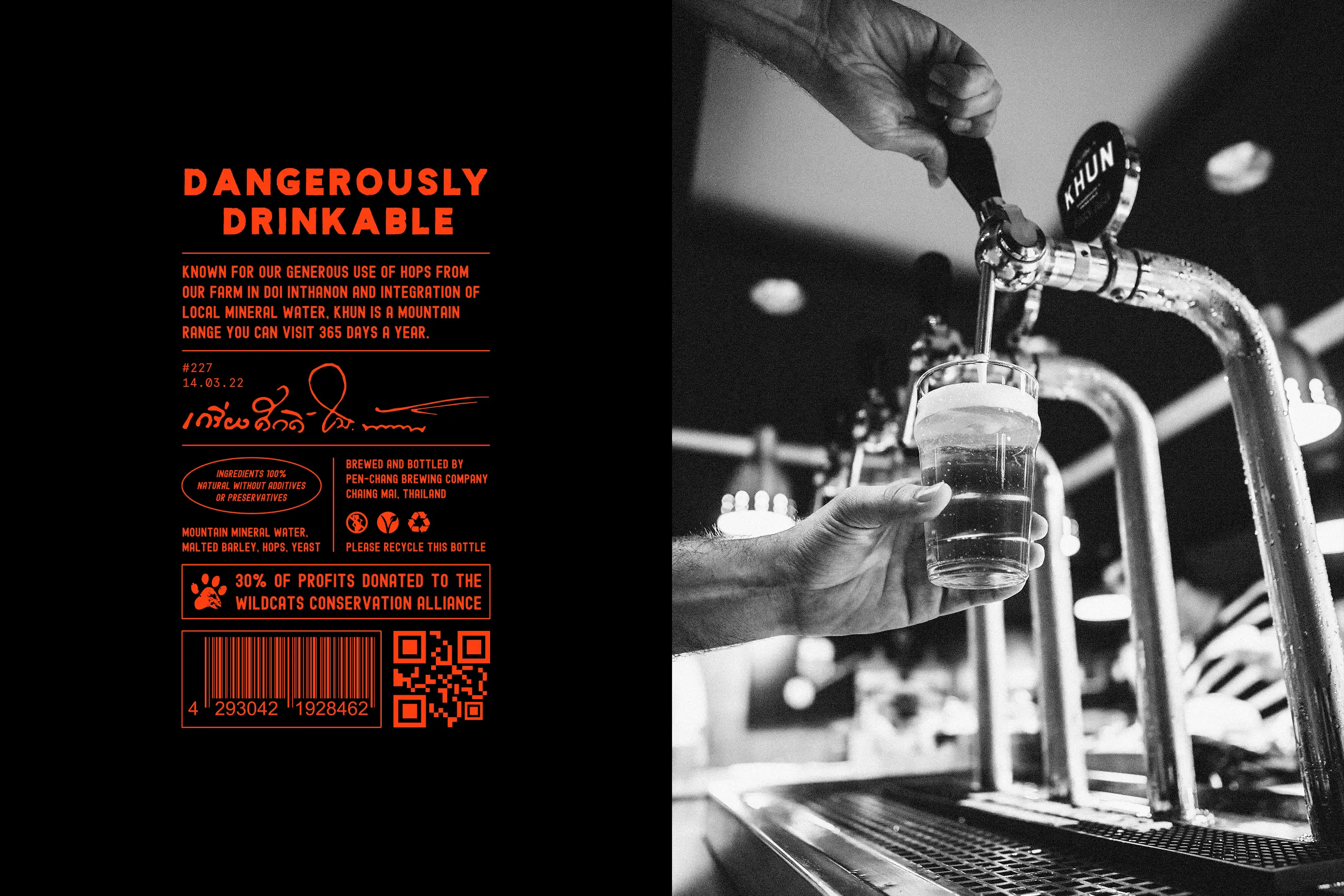
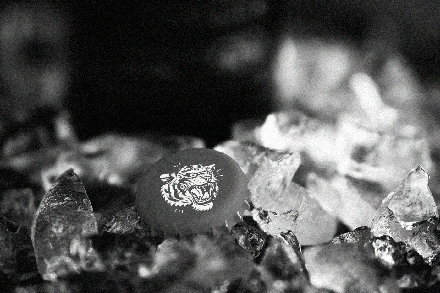
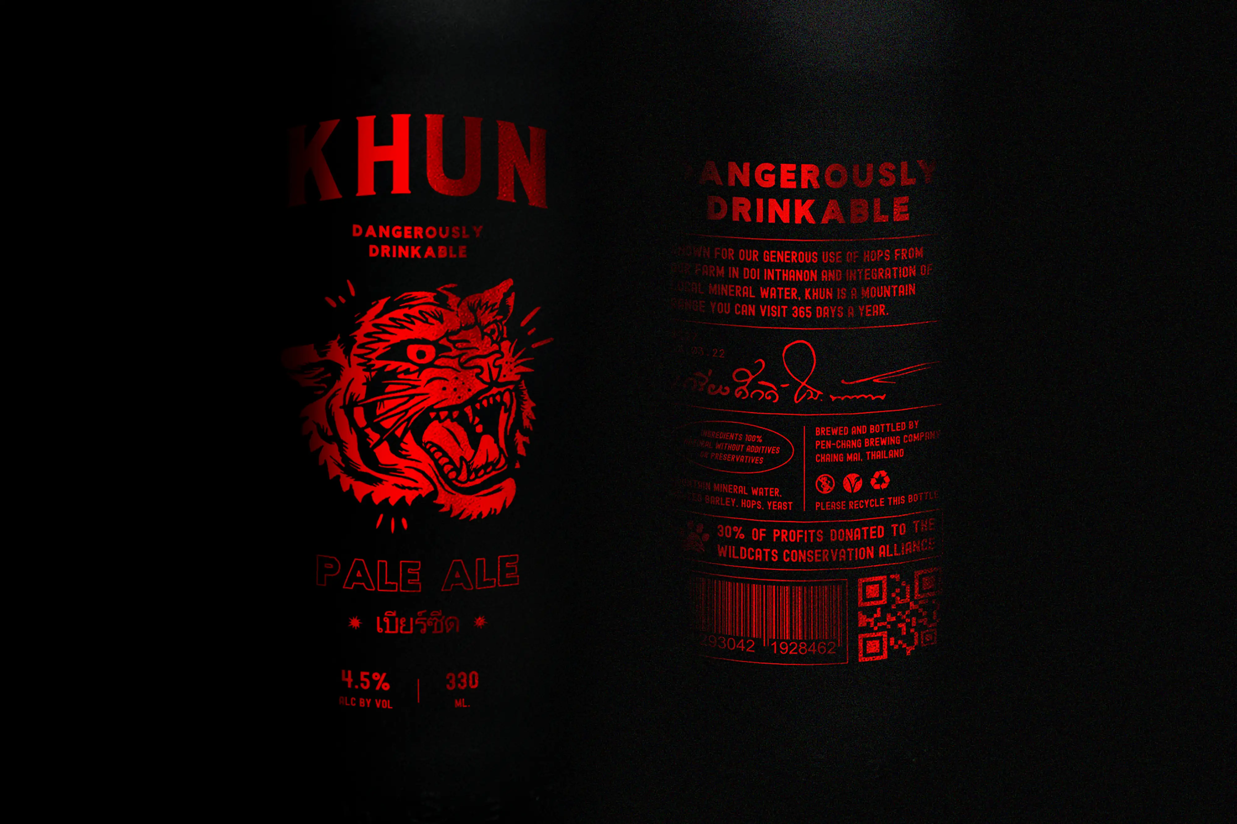
The name Khun was inspired by the Khun Tan mountain range in Northern Thailand. While the design is playful and punchy, the thinking is grounded in place and intent. With tiger populations in the region now considered locally extinct, the beer’s identity was built around awareness and support, with a commitment to donating 30% of profits to the Wildcats Conservation Alliance. Every design detail, from the snarling tiger to the raised typography and copy line Dangerously Drinkable, ties into that core narrative.
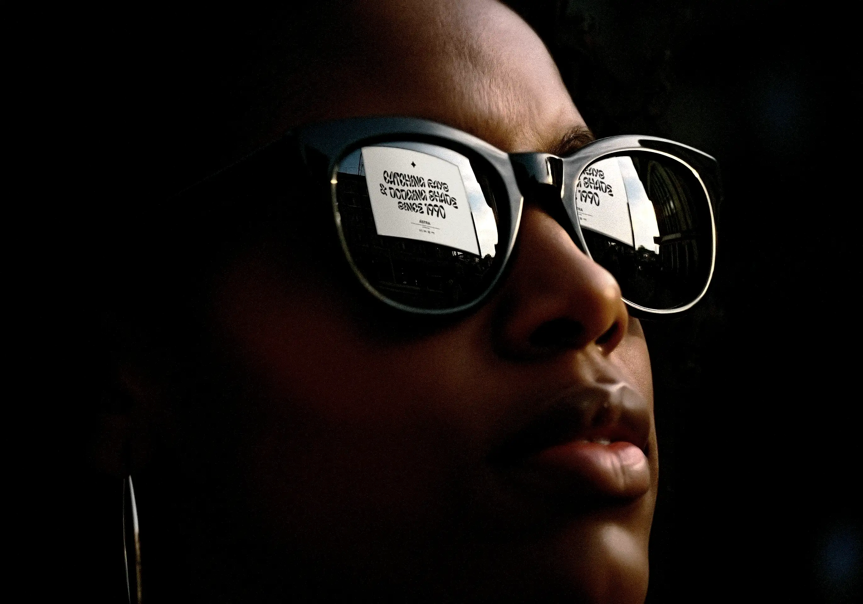
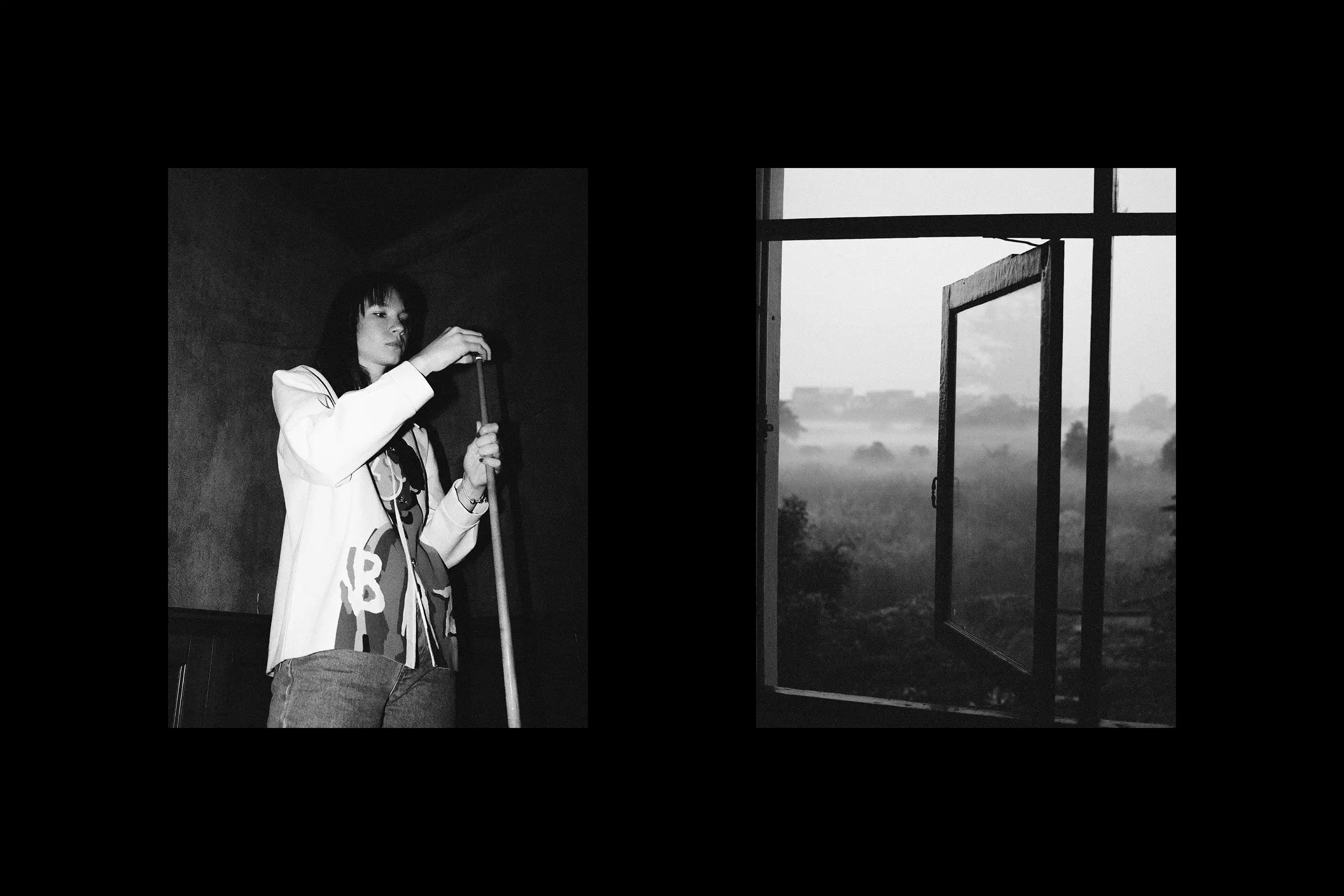
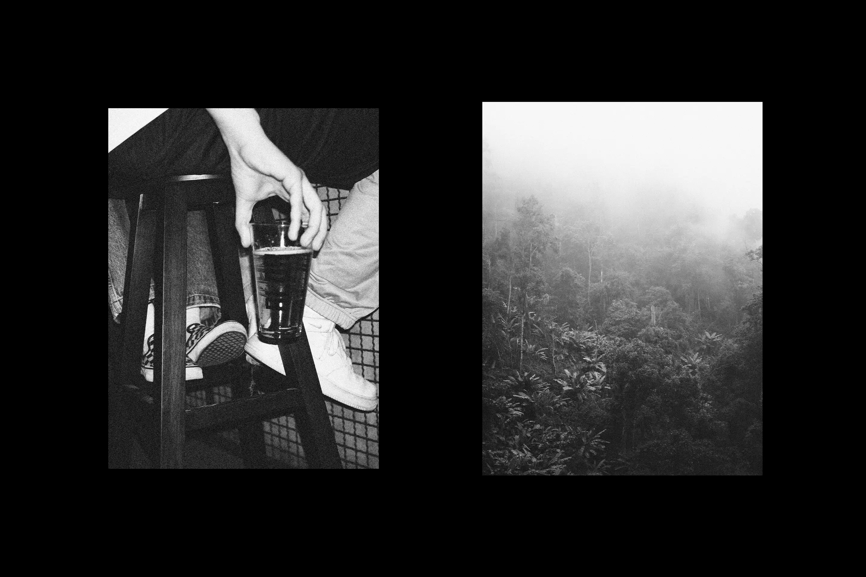
This project became a pivotal exercise in understanding how photography can shape tone. Found imagery was treated, regraded and repurposed to create a coherent world that matched the visual identity. From mist-covered mountain ranges to humid bar shots and candid stills, the result is a brand that lives in a specific mood. Not just a product, but a feeling.
Khun is full of energy. Loud in colour, sharp in tone, unapologetically expressive. The packaging balances clarity with chaos, using red-on-black contrast, overprinted text and a raw, slightly unpredictable feel. But that confidence is backed by detail. Ingredient sourcing, donation messaging and conservation cues give the brand real weight without slipping into preachy territory.
Khun is a case study in contrast. It explores how a product can feel rebellious and wild without being throwaway, and how visual energy can still hold clarity and meaning. It’s a packaging-led concept, but one that shows how identity, copy and image can work together to create something with attitude, depth and cultural texture.
With Khun, the aim was to show that a brand can feel bold and rebellious while still carrying real meaning.